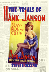
I've tried to keep up the pace of last week when I was finishing off the
Sexton Blake Annual 1941 – due for release in mid-October. I'm now in the middle of laying out a new book,
Not Forgotten, which will collect together some 35 biographical sketches. Most began life as obituaries, written for
The Guardian or Bear Alley but you might think of them as the "Director's Cut" versions.
When I do an obituary, I tend to write without much thought to the wordage requested, so my first draft is usually a lot longer than what you see in print. Rather than let these longer pieces disappear forever, I'm putting them together in an A4 saddle-stapled book. I wanted to set some limits on this project, so the first volume will cover 2009-10 and it is intended to cover cartoonists and comic strip creators who died in those years who had connections with British comics – which means quite a few European and South American artists are also included and my abilities to read/translate a wide range of languages are being tested to the full!
The book so far includes the following: Alan Hemus, Tony Hart, Robert Peacock, Jose 'Pepe' Gonzalez, Jose Casanovas Sr., Ron 'Nobby' Clark, Malcolm Douglas, Bernet Toledano, John Donegan, Adrian Kermode, Giorgio Bellavitis, John Ryan, Francisco Hidalgo, Roy Raymonde, Carlos Roume, Ricardo Garijo, Terry Challis, Xavier Musquera, Francis 'Smilby' Wilford-Smith and Geoffrey Bond. I'll post the names from the second half of the book next week, but this will hopefully raise your interest levels.
If this is a success, I'm wondering whether it might be a format that I can publish the A-Z of British comic book and story paper creators in. That, I suppose, would be my dream project, but it has been an almost impossible project to work on because of the time required to write even a single entry. But if I was to do it in bits... well, it's something to think about, although chances are I'd be staggering towards bankruptcy whilst complaining about how busy I was.
I seem to write less and less for print publication these days. I used to write a lot of short features, news columns and the like where nowadays I'm writing or compiling longer pieces for books – I've self-published six books this year so far and should have at least three more out before Christmas. They're not making me a living – not by a long shot – but I do find the mixture of long and short features plus some books heavy and some lighter on artwork quite satisfying. I just wish it paid a little better.
A feature I wrote on British comics that I wrote some while back has appeared in Spain in the latest volume of
Del Tebeo al Manga: Una Historia de los Comics, compiled under the watchful eye of Antoni Guiral. This is volume 9 (of 12) – I contributed to volume 7 a couple of years ago and it's an amazing series of books. Such a shame that a similar series is unlikely to ever appear in the UK.
Random scans... I'm clearing some of the clutter on my computer's desktop which is threatening to become unmanageable. I already have the icons reduced to their smallest size, but the screen is still full! So, here are some images I've been meaning to do something with.
The first one arrived earlier this week from Alistair Moffatt. The White Feather Mystery is slim (16-page) booklet published in 1945 by Regency Press. The author byline is Margaret Williamson, although whether this is a real name or a pen-name is unknown. The bulk of Regency's output was written by
B. E. M. Ward and the fact that Blanche Ward used that form of her name on a variety of different types of book (crime, romance, short story collections) makes me doubt that she would have adopted a pen-name for this one.
I have a feeling that the original scan for this one came from David Ainsworth. This is a green version of a book I have also seen with an orange cover and which also had red and purple variations. Quite why this was I have no idea but it seems to have been common practice with these early examples of the Mellifont Library when they were first published in the late 1930s. The cover image was identical in each case. Variations exist for the first twenty volumes (Woodhall's was the first in the series), published in 1937-38; number 21 was published in 1942 and the war must have been making itself felt. Perhaps the print runs were so short that changing colours was impossible. Around the summer of 1944, the Mellifont Library started publishing illustrated covers.

The next image is not a book (maybe you guessed that already) but a bear... Richard Lion, to be precise. This was a toy bear produced by Merrythought in 1955-56. Richard Lion was based on the character created, I believe, by Jessica Morris, wife of
Eagle editor Marcus Morris. She was certainly an early writer of the series when it debuted in the first issue of
Robin in 1953; Richard Lion continued to appear until 1967, although the original author was long gone as was the original artist, Maria Jocz.
Richard Lion, permanently dressed in a red fleece and green scarf,
topped with a red school cap, was an adventurous young lion cub who lived
in the village of Gay with his mother and father. His best friends are
Pug (a dog) and Henry (a baby kangaroo). Richard's adventures were
many and varied: on holiday he helped free some magpies from an
underground trap, he battled underwater pirates at Davy Jones' locker
and met the Star-folk of Starland who rode on winged ponies. Richard
reached these lands in a variety of ways, from meeting a magic fish to
stumbling across a talking kite. Many other adventures took place around
the village where Dr. Lion was kept busy with a stream of injured
animals taken in by his young cub.
And finally, a gag illustration by Jane artist Norman Pett in a style I've never seen from him. This illustration appeared in
Union Jack 1324 as part of the "Tinker's Note-book" feature for 2 March 1929.
Next week: Rookwood concludes on Tuesday. Who knows what will be happening after that... certainly not me!
(* Judge Holland badge was created at Michael Carroll's
judge badge software page.)




.jpg)