Friday, September 07, 2012
Comic Cuts - 7 September 2012
Two bits of good news. The Sexton Blake Annual 1938 is now shipping out so those kind folk who pre-ordered the book should see their copies next week. And the next (third) one, the 1941 annual, is finished – I'm now waiting on a proof to make sure it prints up OK. But I'll be giving your wallets a bit of recovery time... the 1941 isn't due to be released until mid-October. The fourth and final volume will follow at the end of November.
That hasn't left much time for anything else so I'm going to run with a suggestion from John Ashbrook and briefly talk about how these books are put together. I often mention that I have been cleaning up pages but I haven't posted any examples for ages. So here's a page as scanned and as it looks now:
The problem with these old annuals, particularly the annuals from any time in the 1940s, is that paper was scarce and usually recycled. By the late 1940s, the paper was often grey and shouldn't have been used for anything other than bus tickets, but publishers were desperate and would print on anything they could lay their hands on.
The annuals I am working with are printed on wartime pulp paper: they're yellow with age, there's a certain amount of foxing and damage from smoke. But even when you remove the yellow tint there are further problems. If ink doesn't adhere to the page where it's supposed to land, it doesn't disappear. It splashes onto other bits of the page.
So when I clean up a page, that's the kind of thing I'm looking at. I try to do a minimum of 30 pages a day, so that's roughly 15 minutes a page. Starting off with straightening and trimming the page, I then look over the page for major problems – on the page above that would include the damage to the box around the text, but often involves blobs of ink obscuring text, title lettering that is showing a lot of wear and tear and broken lines. These are fixed with the pencil tool, clone stamp and eraser tool. Some of the minor damage can also be fixed with filters, but I find that the filter tools can often cause more problems than they solve, so I only use them occasionally.
I then check for damaged text, reinserting missing or damaged lettering using the clone stamp. I don't go overboard with this as most of the text is legible even if the lettering is slightly imperfect. I could tell you that it's because I want to bring that authentic look to the page, but really it's because there just isn't enough time in the world to fix every missing stroke or curve. I only have 15 minutes a page before the whole thing becomes financially ruinous. As long as the text can be read, that's fine... and in the majority of cases the page is actually quite a bit better than the printed page it was scanned from, so you're getting visual value for your money!
The original scans are 1,200 dpi, so once all 160 pages are cleaned up, I shrink them down to 300 dpi, and lay them out as a book using In Design. The printed books have an additional four pages at the beginning: a title page, a copyright page, a contents page and a blank page. These can be quickly assembled and, before you know it, you have a 164 page book as a PDF. I use the PDF tools to put in page numbering and the finished PDF is ready for the printer. The covers are prepared in the same way and these are also sent off as a PDF.
And then there's some science or magic that happens and back comes a printed book.
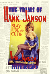
Random scans. For a change of pace, some Hodder Yellowbacks I found I had scans for, plus a Milestone gangster sent over by Morgan Wallace.
Next week, we continue with the highwayman adventures of Rookwood. I hope you're all enjoying Tony Weare's fantastic artwork.
Labels:
Comics News
Subscribe to:
Post Comments (Atom)


No comments:
Post a Comment